
Choosing the Right Frame Size and Colour
At the workshop we print immense landscapes, fine art editions, tender family photographs and everything in between. Does such diverse subject matter require a different approach when selecting frame size and colour? Or can one frame fit all?
As this article explains, the artwork is just as important as its environment when selecting a frame. So, for anyone unsure of what frame to choose, we’ve compiled a few simple guidelines to keep in mind...
The right frame for your artwork
Imagine a portrait of a gentle newborn framed at extra large 120 x 80cm with a black finish. Or a vast Icelandic glacier reproduced at a small 20 x 30cm…
Whilst there really is no right or wrong way when framing, we think that sensitivity should be given to the subject matter when selecting your frame size or finish to pay homage to the work or its artist.
When selecting a frame, consideration must be given to the artwork subject matter and the environment around it.
Personal photographs and portraits
In our recent Q&A with interior designer Jenna Densten, she says ‘ultimately you want to walk into a house and get a feel and a taste for the family who live there, and the design to be reflected through that.’
As Jenna suggests personal photographs are instrumental in constructing a warm, welcoming environment. It allows you to set the tone for your house by sharing the things you profoundly value - be it a photograph of your grandparent’s wedding, your own wedding, children, or even pets.
That said, it’s important to strike a balance between displaying your personal imagery and maintaining a sense of privacy - which is why, unless you’re a huge extrovert, you may prefer smaller frames for personal photographs and to display them in less overt places (e.g. a fireplace mantle as opposed to suspended alongside the dining room table).
"It’s important to strike a balance between displaying your personal imagery and maintaining a sense of privacy"

Filling your home with personal prints creates a warm environment, but we suggest framing family photographs at a smaller scale and positioning them in less conspicuous places. Would you like your most intimate family photographs looming over the dining table? Maybe not...
If the photograph or artwork is softer in tone, we suggest selecting a natural or white frame. It may be too much of a contrast for a family photograph in a natural landscape to be framed in black. Of course, this is subjective and circumstantial... a monochrome portrait may be better emphasised in a striking black frame white white border.
Landscapes
As a general rule we think landscape photography is deserving of large and extra large frames. It feels wrong to confine the works of artists like Kate Ballis, John Laurie or Kane Alexander to a small frame.
Although striking, landscape compositions are often more simple in composition - with more ‘white space’ or uninterrupted expanses of sky, terrain or water. This means they are less imposing when framed at a large scale and can be used as a statement piece in the space.
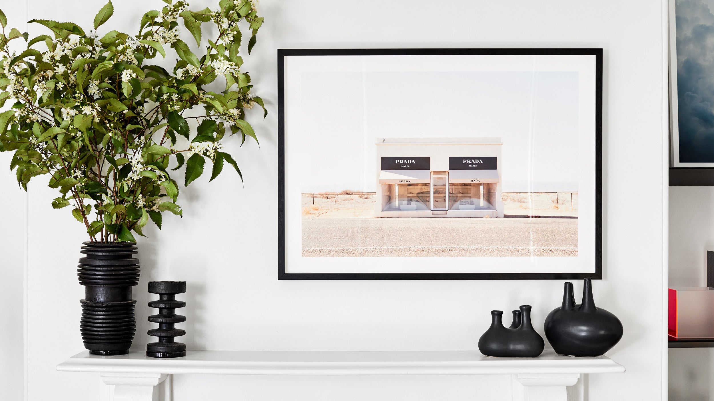
When choosing a frame colour for your landscape be guided by both the work and the space. A black frame may overpower a light seascape, whereas a dark, soulful landscape could be accentuated by a black frame or similarly juxtaposed with a crisp white frame.

When it comes to landscape prints, bigger is better. Just remember to anchor your framed piece to other furniture in the space for context.
Fine art or editions
When printing an artwork or edition, be guided by the artist’s character and the feel of their work. A piece from an artist like Anna Thomas of Fractured Flora who produces explosive, dark, dynamic artwork may warrant a more striking black frame, whereas an artist producing light, airy lifestyle photography like Camilla Quiddinton may be better suited to a natural or white frame.

Anna Thomas (left) and Camilla Quiddington (right) illustrate the need to choose a frame colour that accentuates the work.
Select a size based on the complexity of the subject matter. A mini frame may not do an intricate Fractured Flora photograph justice, whereas a simpler piece can be scaled down without losing its impact.
Consider your space
In black, white and natural Victorian ash our frames are inherently neutral and versatile and won’t offend in any space. However, with consideration the right frame colour can be used to create contrast or compliment a space.
Light, neutral spaces are best suited to natural or white frames.
White frames on white walls, or black frames on black walls can also be employed to make artwork stand out from its surroundings, as if suspended in space.
Don’t be afraid to work with a series of sizes and finishes either. As you can see in our Salon Hang blog, clustering different frames or using different sizes / colours in a space will produce a more eclectic outcome and ‘lived in’ feel.

An example of a gallery wall from our Salon Hang blog, with works printed for customer Adam Roggero.
A final note for the renegades: frame however you want. With something so deeply personal — like a sentimental photo or favourite artwork — you will inherently know what works... even if it's an extra large frame, smack bang in the living room with a portrait of your dog.
If you’re still struggling to select a frame and size, contact us at info@formatframing.com.au to explore the best options for your space.